
Shutter Colours
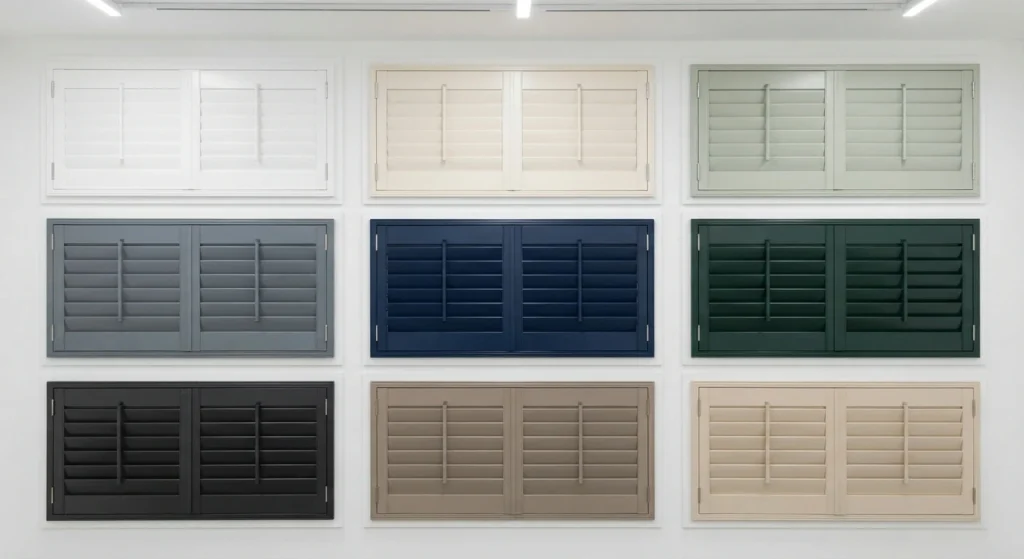
More than just white
Shutters are available in a wide range of colours, from traditional whites and neutral shades to darker colours and more distinctive tones. The colour you choose can affect how prominent the shutters look, how they work with the surrounding room and whether the finished appearance feels subtle or more dramatic.
The available colours will depend on the material and finish you choose, with some suppliers offering a wider range of colours or colour matching. Looking at physical samples can also be useful, as the same colour can appear quite different depending on the light, surrounding colours and material of the shutter.
Popular colours to consider

White
Timeless, bright and easy to live with, white remains the classic shutter choice.
Grey
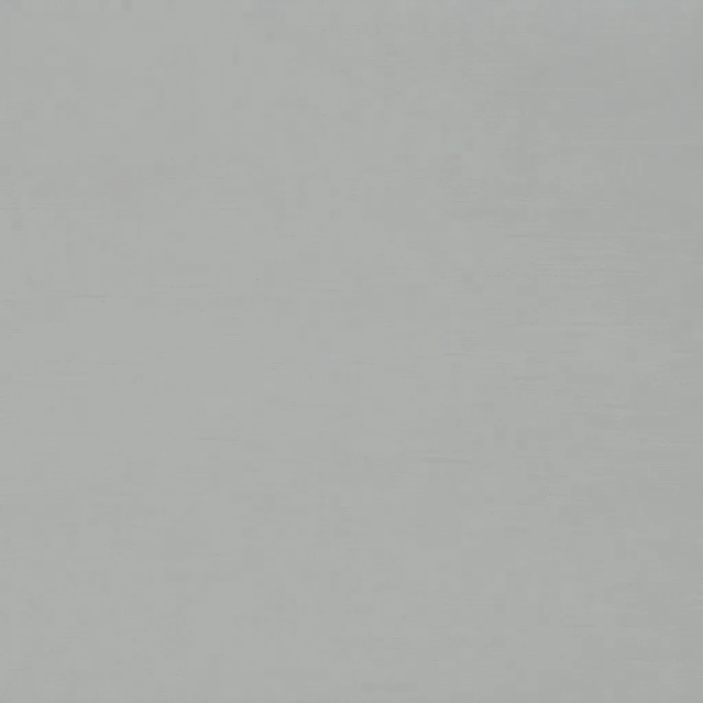
More depth and character than white, with shades to suit both modern and traditional interiors.

Cream
Warm, soft and inviting, cream offers a gentler alternative to crisp white.

Black
Strong contrast makes black shutters a natural choice when you want the window to stand out.

Brown
Warm and earthy, brown works particularly well alongside timber, natural materials and richer interiors.

Green
Bring a touch of nature indoors with a colour that can feel both calming and distinctive.

Blue
From understated to dramatic, blue gives the window plenty of personality without overpowering the room.

Red
Make more of a statement with red, adding warmth and a stronger sense of personality to the window.
Yellow
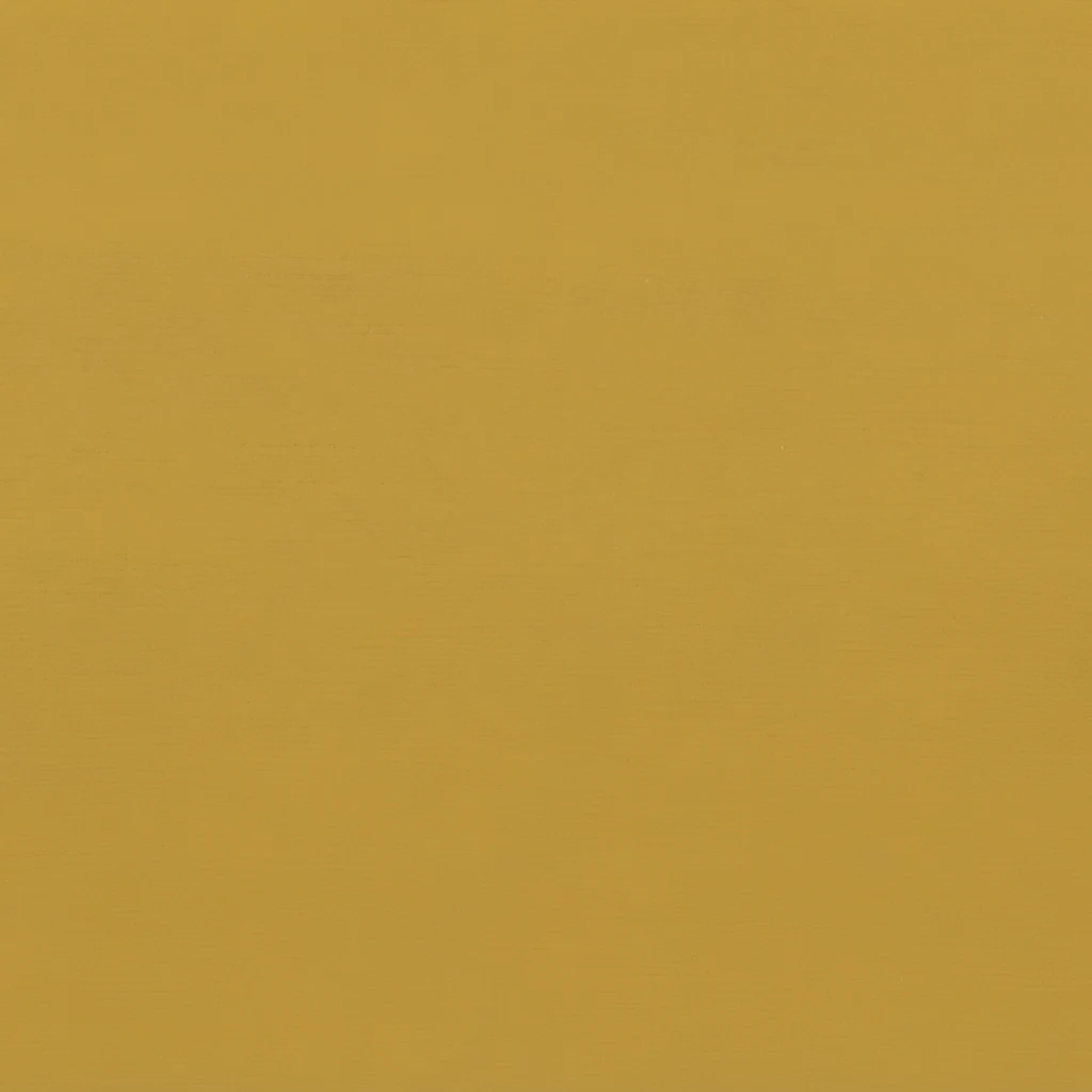
Brighten the room with a warmer, more expressive colour that brings energy to the window.
Natural / Wood
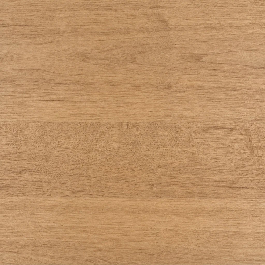
Let the material take centre stage, with visible grain and natural variation forming part of the finished look.
Shutter colours, fully explained…
Colour is one of the most noticeable choices when selecting shutters, but there is more to it than simply choosing a shade you like. The colour can influence how the shutters sit within the room, whether they blend into the window or become a more noticeable feature and how they work alongside walls, flooring, furniture and other finishes.
White and neutral shutter colours
White remains a common choice for shutters because it provides a clean, neutral appearance and can work with a wide range of interior styles. However, there are many different versions of white available, from brighter whites to softer and warmer shades. The difference can be subtle, but it can affect how the shutters look alongside the surrounding walls and window frames.
Neutral colours such as cream, beige and grey provide alternatives to white without introducing a particularly strong colour. Lighter shades can help the shutters blend into the room, while darker greys can create more contrast and make the window more visually prominent.
Darker shutter colours
Darker colours such as black and deeper brown can have a stronger effect on the overall appearance of the window. They can be used to create contrast against lighter walls or to complement darker furniture and other features within the room. The amount of natural light in the room is also worth considering, as darker shutters can appear more substantial when viewed against a bright window.
More distinctive colours
More distinctive colours can be used when you want the shutters to form a stronger part of the room’s colour scheme. Greens, blues, reds and yellows are available in various shades, although the range offered will depend on the supplier and shutter material. Colourful shutters do not necessarily have to match another feature in the room exactly; they can also be used to complement or contrast with the existing colours.
How material and finish affect colour
The material and finish can also affect the final appearance of a colour. A painted finish generally provides a more consistent colour across the shutter, while a stained finish allows the natural characteristics of the timber to remain visible. The same stain can therefore look different depending on the type of timber underneath it.
Natural timber finishes are another option where you want the colour and character of the material itself to remain visible. Rather than creating a completely uniform surface, these finishes allow variations in grain and tone to become part of the finished appearance.
Custom colours and colour matching
Some shutter suppliers also offer custom colours or colour matching, allowing shutters to be made in a shade that is closer to an existing paint colour, interior scheme or other feature in the room. The level of colour matching available will depend on the supplier, material and finish, so it is worth checking what can be produced before choosing a particular shutter.
Why samples are worth considering
Samples can be particularly useful when considering a less common or custom colour. A physical sample allows you to see the colour in the actual room and under both natural and artificial light, rather than relying solely on an image or colour chart. This can be especially helpful when trying to match an existing wall colour, furniture or other finish.
It is also worth remembering that colours can look different in photographs, on screens and under different lighting conditions. A shade viewed in a showroom or online may appear different once it is installed against a particular wall or exposed to natural daylight.
How much choice is available?
Colour availability can vary considerably between products. Some ranges offer a relatively small selection of standard colours, while others provide a much wider choice or may offer colour matching. The material, finish and supplier can all influence which colours are available.
Overall, there is no single colour that will suit every window or interior. White and other neutral shades offer relatively straightforward options, while darker, natural and more distinctive colours can have a greater visual impact. Considering the surrounding room, the amount of natural light, the shutter material and the finish alongside the colour will give you a better idea of how the finished shutters are likely to look.